Brookhaven City Council unveiled the city’s new logo at a press conference Aug. 29.
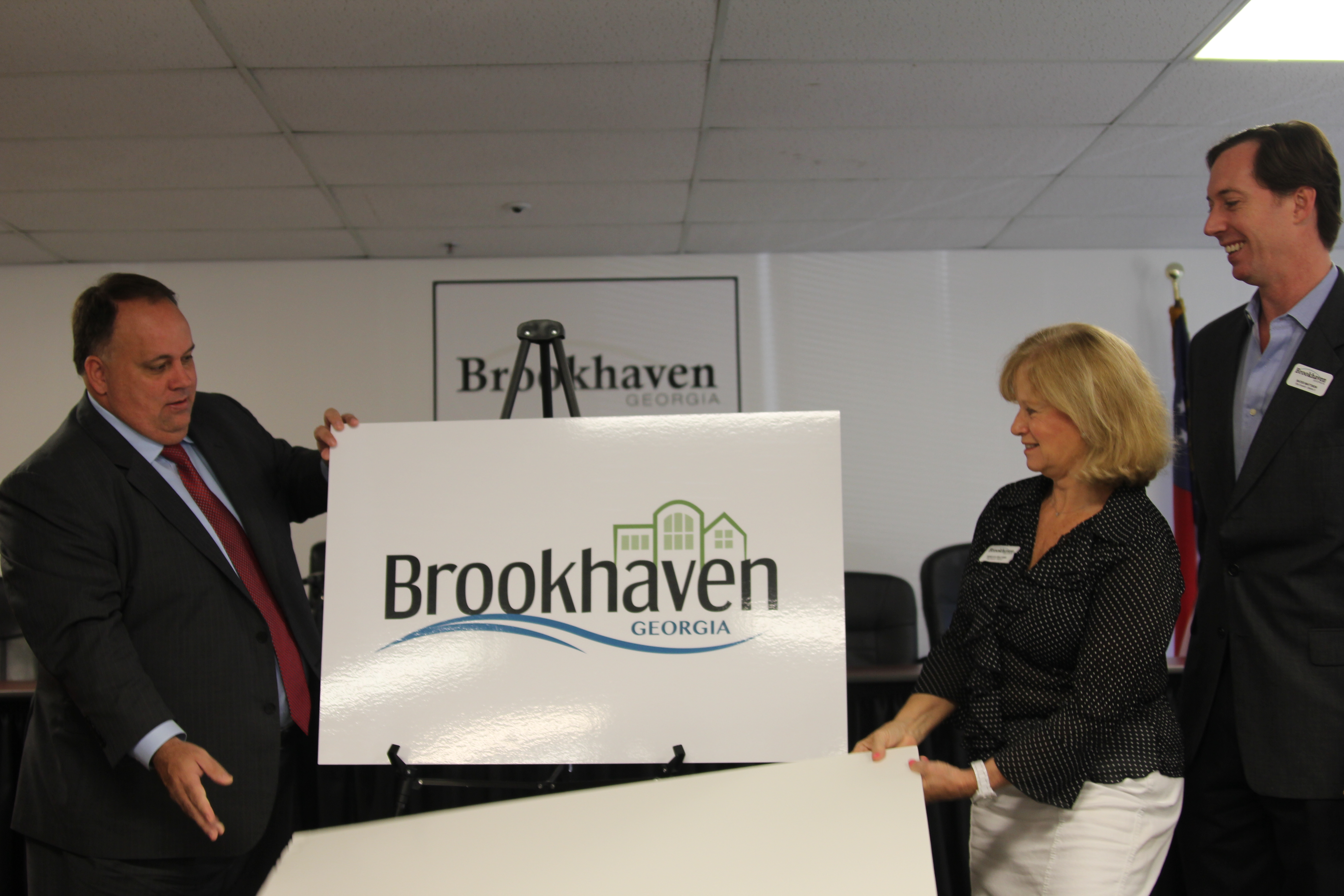
The logo, which features a blue wave underlining the city’s name and green buildings above it, was selected after much input from council members about what they wanted to represent their city, said City Manager Marie Garrett.
“They’ve come up with what they felt depicted the epitome of all good things that represent Brookhaven,” Garrett said.
The logo was designed by Lawrenceville-based Accent Creative Group. The firm presented initial logo designs at a July meeting, but City Council members panned the designs and opted to try again for a new logo that would incorporate symbols they felt would better express the new city.
“One of the unifying things that brought us together was the brook,” said Councilwoman Rebecca Chase Williams, “putting the “brook” of Brookhaven into the logo.”
Mayor J. Max Davis said the blue wave represents the city’s creeks, including Peachtree Creek and Nancy Creek, as well as its lakes, Silver Lake and Murphey Candler Lake.
“Not a lot of people realize the major streams and creeks we have,” Davis said.
The logo also includes buildings, a nod to Brookhaven’s location inside the Perimeter.
“We liked the idea of the “haven,” Williams said. “We are this great city of nature and beautiful homes and residential. But we’re also a vibrant business center.”